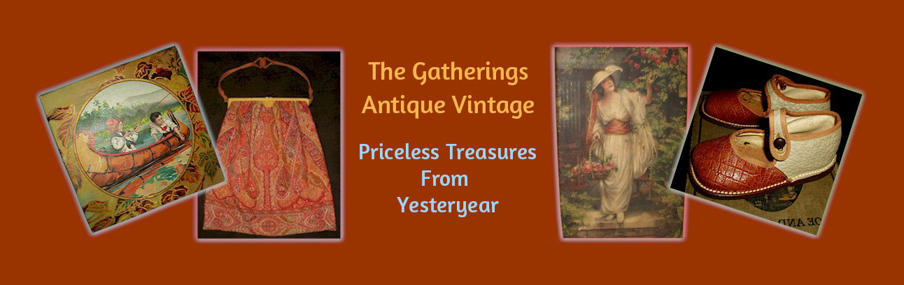
There is something immediately engaging about a fabric that seems to know its purpose—to delight the eye while making the work of the hand just a little easier. This vivid length of early 20th century “cheater cloth” does precisely that, offering both visual complexity and practical charm in one neatly printed design.
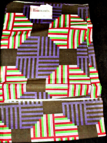
At first glance, the pattern feels almost modern in its boldness. Bands of red, green, white, and deep violet march across a rich brown ground, intersecting in a rhythmic, almost architectural arrangement. The design mimics the careful piecing of patchwork quilting—yet here, it is all illusion. Printed rather than stitched, the cloth achieves the appearance of labor-intensive construction without requiring needle or thread.
This is the essence of what has come to be affectionately called *cheater cloth*.
### The Art of “Cheating” the Quilt
In the early decades of the 20th century, as printed cottons became more widely available and affordable, manufacturers began producing fabrics that simulated patchwork. These textiles allowed homemakers to create the look of a quilt or pieced coverlet with far less time and effort—an appealing proposition in households where both beauty and efficiency were prized.
Such fabrics were especially useful for:
* Quilt tops made quickly for everyday use
* Children’s bedding
* Drapery or decorative covers
* Practice pieces for young or novice sewists
Rather than diminishing the artistry of quilting, these prints represent a different kind of ingenuity—one rooted in accessibility and the evolving rhythms of domestic life.
A Label That Tells a Story
A Cheerful Geometry: An Early 20th Century Cheater Cloth
What makes this example particularly special is the surviving paper label: *“Hamilton Remnants.”*
That small detail transforms this from simply a length of fabric into a tangible piece of mercantile history. Remnant bundles were commonly sold at a discount—ends of bolts, odd yardages, or discontinued prints gathered together and offered to thrifty shoppers. One can easily imagine this piece folded neatly on a counter, selected by someone with a practical eye and perhaps a spark of creative intention.
The typography and presentation of the label suggest an early 1900s origin, aligning beautifully with the style of the print itself—bold, optimistic, and just slightly experimental.
### Color, Modernity, and Motion
The palette is especially striking. The interplay of strong primary tones with darker grounding shades reflects a period when textile design was beginning to embrace more graphic, less floral motifs. There is a sense of movement in the pattern—almost a weaving of stripes within stripes—that feels both playful and deliberate.
It is not difficult to see why such designs continue to appeal to collectors today. They speak to a moment when tradition and modernity overlapped—when the old craft of quilting met the new possibilities of industrial printing.
### A Textile with Presence
As yardage, this piece retains its original intention: it is still full of possibility. Whether preserved as a collector’s textile, studied as an example of early printed design, or simply appreciated for its visual energy, it carries with it the quiet story of everyday life—of making do, making beautiful, and making something last.
In its cheerful geometry and humble label, this cloth reminds us that even the simplest household goods can hold history within their folds.